Ask why one palette feels cozy and another feels crisp and the answer is usually temperature. Warm and cool is the quietest lever in color work and one of the most powerful. Once you can read it, you can steer a palette's mood without changing its hues much at all.
Key takeaways
- Reds, oranges and yellows read warm; blues, greens and violets read cool.
- Temperature is relative — it lives in a hue's lean as much as its position.
- Warm colors advance toward the viewer; cool colors recede.
- The most inviting palettes are mostly one temperature with a small dose of the other.
Where the line falls
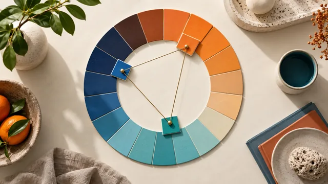
Split the color wheel roughly in half. Reds, oranges and yellows are warm; blues, greens and violets are cool. But the line is not rigid, and that is the useful part: a red with blue in it — a magenta-leaning pink — reads cooler than a red with yellow in it, such as a coral. Temperature is relative, and it lives in the subtle lean of a hue as much as in its position on the wheel.
What temperature does to mood
- Warm palettes feel active, close and inviting. They advance toward the viewer, which is why warm accents make such effective calls to action.
- Cool palettes feel calm, distant and professional. They recede, which makes them excellent backgrounds and excellent choices for interfaces people use for hours.
Warm colors come forward, cool colors step back. You can build depth into a flat design using temperature alone.
Balancing the two
A palette that is entirely warm can feel oppressive over a long page; one that is entirely cool can feel cold and unfriendly. The most inviting palettes are mostly one temperature with a small, deliberate dose of the other. A cool, professional interface warms up instantly with a single warm accent. Our own brand runs on warm plum and blush with a cool-leaning near-black, which keeps it from feeling saccharine.
Neutrals have temperature too
The detail that separates a considered palette from a default one is the temperature of its greys. A warm grey — grey pulled a few degrees toward orange — sits comfortably beside warm brand colors, while a cool grey beside them looks accidental, like two palettes overlapping. Pick the temperature of your neutrals to match the brand, and an interface stops looking like a template with colors applied to it.
Steering temperature in a generator
When you generate an analogous palette, you are staying within one temperature zone, which keeps the mood consistent. When you generate complementary, you almost always cross the warm-cool line, which is precisely why complementary palettes feel dynamic — they carry built-in temperature tension. Choose the harmony rule with the mood you want in mind, a connection covered in color harmony explained simply.
Check temperature with HSL
If you are unsure whether a color is warm or cool, read its hue value in the color converter. Hues roughly between 0 and 60 degrees, and above about 300, lean warm; the middle of the range leans cool. The boundaries are soft, but the numbers settle arguments the eye cannot — particularly the arguments about ambiguous greens and violets that sit close to the dividing line.
Temperature as a wayfinding tool
Beyond mood, temperature can carry structure. Give a product's primary workspace a cool, receding palette and its action surfaces a warmer treatment, and users learn the difference without being told — warmth begins to mean "you can do something here". The same trick separates editorial content from commerce, or a marketing site from the app it leads into. Keep the shift small and consistent; a few degrees of hue and a modest saturation change are enough for the eye to register a boundary. Applied at scale, temperature becomes one of the cheapest navigational signals available, because it costs no space and no words.
Frequently asked questions
Is green warm or cool?
It depends on its lean. Yellow-greens read warm, blue-greens read cool, and mid-green sits close enough to the line that surrounding colors decide how it is perceived.
Can a palette be entirely warm?
Yes, and many food and hospitality brands are. Add temperature variation through lightness instead, or the palette becomes heavy across a long page.
Does temperature affect readability?
Indirectly. Contrast decides readability, but warm backgrounds tend to feel brighter at the same measured lightness, so verify pairings rather than trusting the impression.
For temperature applied across a whole campaign, see seasonal color palettes that feel right.