Clients rarely hand you a hex code. They hand you a word: calm, premium, playful, autumn. Turning that word into a palette feels like the hardest part of the job, but it follows a repeatable path. A palette generator from a word is really a two-step move: translate the word into color properties, then let the tool expand it.
Key takeaways
- Mood lives in saturation and lightness more than in hue.
- Break the brief word into three dials: energy, weight and temperature.
- Seed one color that satisfies all three, then let the generator spread it.
- Sanity-check by saying the word out loud while looking at the result.
Words map to properties, not hues
The common mistake is jumping straight to a hue — "calm means blue." Mood lives far more in saturation and lightness than in hue. The same blue can feel icy, corporate or cozy depending on how light and how saturated it is. Break the word down into three dials instead:
- Energy maps to saturation. High-energy words want vivid colors; quiet words want muted ones.
- Weight maps to lightness. "Airy" and "delicate" sit light; "grounded" and "premium" sit dark.
- Temperature narrows the hue. "Warm," "cozy," "fresh" and "clinical" each point at a region of the wheel.
A worked example: "autumn"
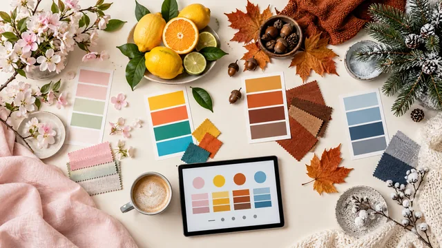
Autumn is warm (reds, oranges, ochres), moderately saturated (nothing neon), and mid-to-dark in weight. That gives a starting hue around 25 to 40 degrees, saturation near 55 percent, and lightness in the 30 to 50 percent band. Enter one color that fits — a burnt ochre, say — and generate an analogous palette. The result reads as autumn because the properties match the word, not merely because the hue is orange.
A second example: "premium"
Premium is low energy, heavy weight, and deliberately narrow in hue. That means low saturation, low lightness, and a monochrome or near-monochrome relationship, usually with a single metallic or bright accent used sparingly. Notice that the hue barely matters here: deep navy, deep plum and near-black charcoal all read as premium, because the mood is carried entirely by the other two dials.
Keep a small notebook of word-to-property translations you have used. Over time it becomes the fastest brief-to-palette shortcut you own.
Let the generator do the spreading
Once your seed color captures the mood, the generator's job is to expand it into a coordinated set without losing that feeling. Analogous keeps the mood tight and consistent; complementary introduces tension, which suits words like "bold" or "dynamic" and undermines words like "serene". Lock the seed and try both — the comparison takes seconds and usually settles the question.
When the word is ambiguous, ask for a reference
Some words carry no reliable color consensus. "Modern" means one thing to a fintech founder and another to a ceramics studio. When a brief word is doing too much work, ask for two or three reference images instead, then extract from them and compare the extractions against your property breakdown. Agreement between the word and the references is what you are actually looking for.
Sanity-check against the word
Finish by looking at the palette and saying the word out loud. If it does not feel like the word, the culprit is usually one swatch that is too saturated or too light for the mood rather than the whole set. Adjust that single color before starting over — most near-misses are one dial away from right.
Present the palette with the word attached
When you show the result, show the translation as well: "you asked for premium, which I read as low saturation, dark weight and a single restrained accent — here is that palette". Two useful things happen. Clients who disagree now disagree with a specific dial rather than with your taste, which turns a vague "I'm not feeling it" into "can it be lighter?" — a request you can act on in seconds. And clients who agree have learned the vocabulary, so the next round of feedback arrives in the same terms. Making the reasoning visible is what separates a color proposal from a color guess.
Frequently asked questions
Do color-emotion associations work across cultures?
Only partly. Saturation and lightness associations are fairly consistent, but hue meanings vary a great deal by culture and context. Check your assumptions when designing for an unfamiliar audience.
How many words should a brief contain?
Two or three at most. A longer list usually contains contradictions, and a palette cannot be both airy and grounded at the same time.
Can I start from a word and an existing brand color?
Yes, and it is the most common real case. Lock the brand color and use the word to choose the harmony rule and the tone of the partners around it.
For the temperature side of this, read warm and cool colors in a palette.