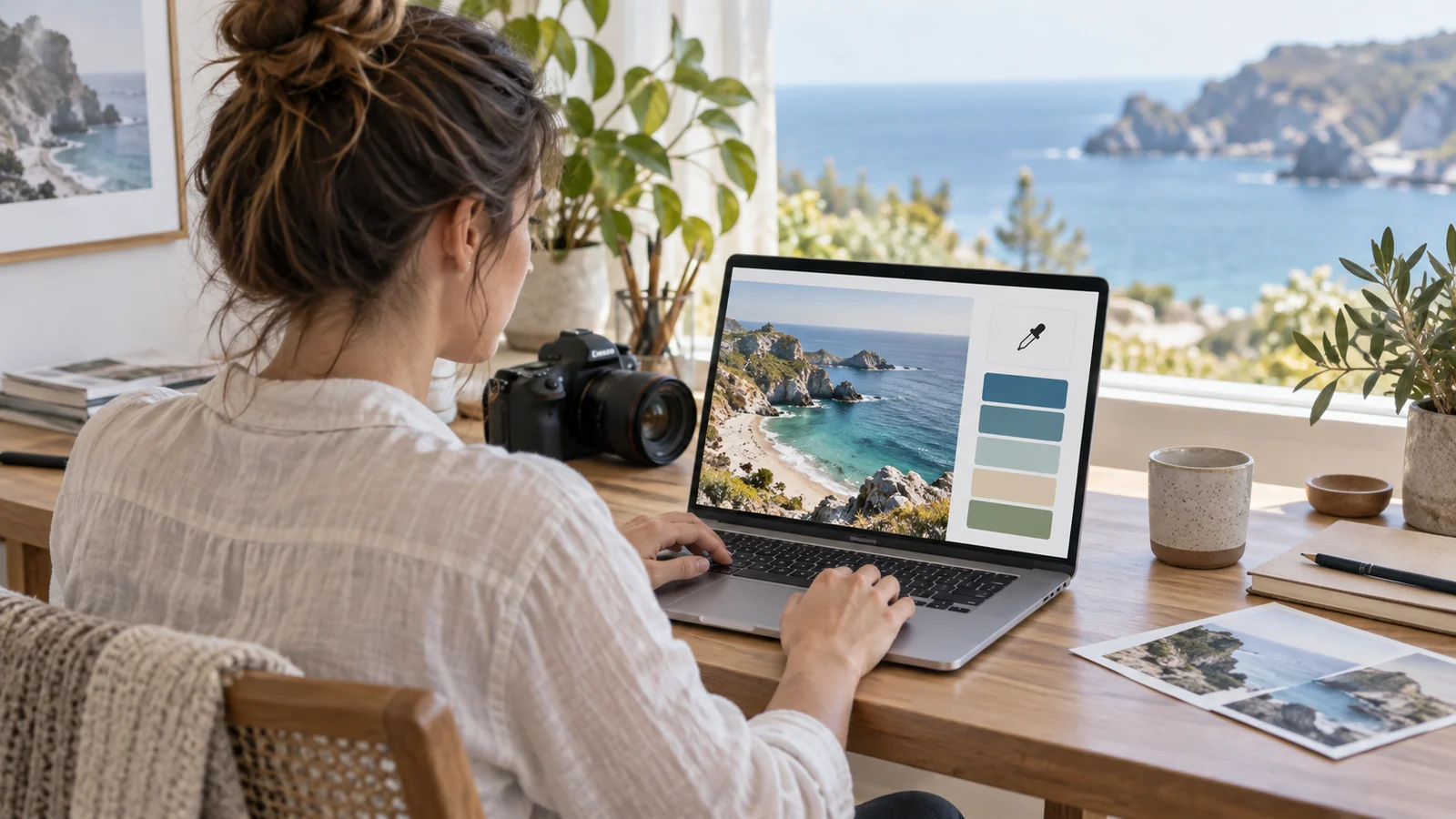
A palette generator from an image answers a question designers ask constantly: which colors are actually in this picture, and which of them belong together? Instead of eyedropping pixels one at a time, the tool reads the whole image and hands back a short, usable set you can drop straight into a design.
Key takeaways
- Extraction quality depends far more on the source image than on the algorithm.
- Each swatch is the average of a cluster of pixels, not a single pixel you can point to.
- Crop before you upload — a large dull region will dominate the result.
- A raw extraction is a draft: replace near-neutrals, widen the lightness range, then lock and regenerate.
Start with the right source image
Extraction quality depends far more on the input than on the algorithm. A photo with a clear subject, a limited color story and even lighting produces a cleaner palette than a busy, evenly mixed scene. Before uploading, ask three questions:
- Is there a dominant color? Images anchored by one or two strong hues extract predictably.
- Is the lighting consistent? Harsh shadows and blown highlights add near-black and near-white noise that crowds out the real colors.
- Does it match the mood you want? The generator can only return colors that are present, so pick a photo that already feels right.
What happens after you upload
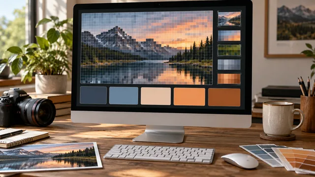
Behind the scenes the tool samples pixels and groups similar ones together, then reports the center of each group as a single swatch. A five-color result is really five clusters of many thousands of pixels each. That is why the returned colors rarely match any individual pixel exactly: they are averages that represent a region of the image rather than a point in it.
If a palette comes back muddy, the source likely had one large mid-tone region — a grey sky, a beige wall — that dominated the clustering. Crop to the part of the image you care about and try again.
Refine the result in three edits
A raw extraction is a starting point, not a finished palette. Three quick edits usually make it usable.
1. Replace the near-neutrals
Extraction often returns one or two colors that are almost grey. Decide whether you want a true neutral in the palette; if so, choose a clean one deliberately rather than keeping the muddy extracted version, which will look accidental next to the colors you did choose.
2. Balance the lightness
Convert each color to HSL and glance at the lightness values. A palette where everything sits between 40 and 60 percent lightness will feel flat and give you nowhere to put text. Push one color lighter and one darker so you have room for both backgrounds and body copy.
3. Lock and regenerate
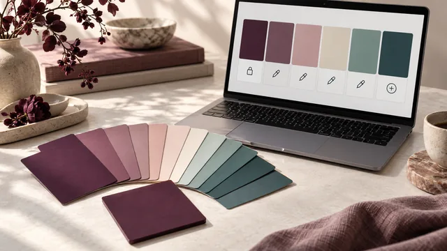
Keep the two or three colors you love, lock them, and let the generator rebuild the rest around them. This preserves the character of the photograph while quietly fixing the weak swatches — the fastest route from a promising extraction to a working palette.
From palette to design
Once the palette feels right, assign roles before you use it. One color becomes the dominant surface, one the primary accent, and the rest support. A palette with no assigned roles is just a row of swatches; a palette with roles is a design system. Our branding guide covers that step in depth.
Check it where the words live
Photographs are forgiving; text is not. Run your intended text-and-background pairs through the contrast checker so a palette that looked beautiful in a landscape stays readable in a paragraph. This is the step most extracted palettes fail, because photos rarely contain both a very light and a very dark color.
Build a small library of source images
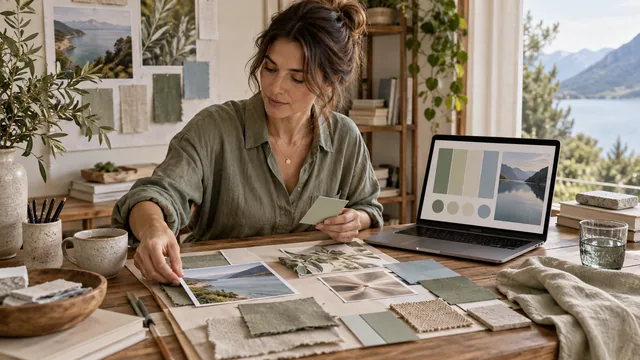
Designers who use image extraction well tend to keep a folder of reliable sources rather than searching fresh each time. Photographs with a strong single subject, textiles, ceramics, film stills and architectural details all extract cleanly, because each has a limited color story and even lighting. Save the ones that produce good palettes alongside the palettes they produced, and note the crop you used. Over time the folder becomes a personal color library that is faster than any stock search and far more consistent, since palettes drawn from a coherent set of sources tend to sit comfortably together across a brand's campaigns.
Frequently asked questions
How many colors should I extract from one image?
Five is a good default. Ask for more and the extra clusters tend to be near-duplicates of colors you already have.
Does image resolution affect the palette?
Barely. The tool samples a representative subset of pixels, so a large upload mostly costs time rather than changing the outcome.
Can I extract a palette from a logo or screenshot?
Yes, and flat graphics extract more precisely than photographs, because the clusters are tight and the averages land close to the original colors.
For the algorithm behind the clustering, read how a palette generator reads color.