How a Palette Generator Reads Color
A look under the hood: how the tool turns pixels or a hex code into a coordinated set, and why HSL does the heavy lifting.
Free color palette generator
Palette Generator builds coordinated color schemes in seconds. Start from one color, paste a hex code, or pull colors from an image, then lock your favorites and refine the rest. Every value is exact and ready for code.
The tool
Start from a base color, a hex code or an image. Choose a harmony rule and how many colors you need, lock the swatches you want to keep, then copy a single value or export the whole palette as code.
Press Space to generate a new palette, or drop an image anywhere on this panel. Locked colors stay put.
Converter
Paste any color and every format updates together. Click a field — or its copy icon — to copy the exact value. This is the number you can trust when you take a color into code or into print.
Catalog
Ten tones from the brand family, light to dark. Click any card to copy its hex, or use them as a worked example of a balanced monochrome ramp.
Reference
Common named colors across design and CSS. Click any chip to send it straight to the converter above and read its full formula.
How it works
A palette generator does not pick colors at random. It places them using relationships from the color wheel, then spreads their lightness so you get colors for both text and backgrounds. Choosing the relationship is how you steer the mood of the result.
Monochrome stays calm and safe; analogous feels rich and cohesive; complementary gives you a built-in accent; triadic and tetradic add bold, balanced variety. The tool handles the math — your job is to pick the rule and refine the tone.
Applied
A single saturated accent against neutral surfaces gives an interface a memorable brand mark without overwhelming the layout.
Pair a primary with supporting neutrals and one accent to build a palette that holds up across a logo, packaging and print.
Triadic and tetradic palettes give illustration vivid, balanced color sets that stay coherent across a whole composition.
Distinct, lightness-separated colors keep charts readable and remain distinguishable for viewers with color vision deficiency.
Accessibility
A palette is only usable if its text can be read. Check any foreground and background pair against WCAG before you ship it.
Implementation
:root {
  --primary: #8B2D55;
  --accent:  #FFA8C2;
  --ink:     #28151F;
  --surface: #FFF9FB;
}
$primary: #8B2D55;
$accent:  #FFA8C2;
$ink:     #28151F;

.button { background: $primary; }
colors: {
  brand: {
    primary: '#8B2D55',
    accent:  '#FFA8C2',
    ink:     '#28151F',
  }
}
From the blog
Practical writing on generating palettes, color harmony, accessibility and taking colors into real projects.

A look under the hood: how the tool turns pixels or a hex code into a coordinated set, and why HSL does the heavy lifting.

Generate a palette here, then set it up as reusable styles or variables so your whole file stays consistent.
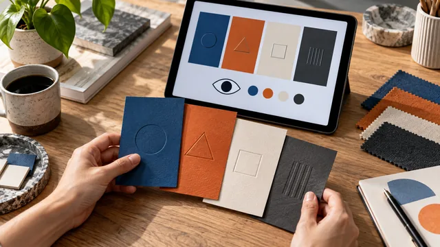
Around one in twelve men sees color differently. Here is how to build palettes that still communicate for everyone.
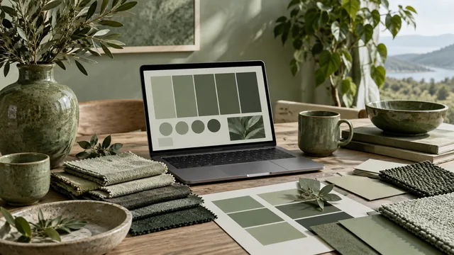
One hue, many shades. Monochrome is the easiest palette to build and the easiest to make boring. Here is the difference.
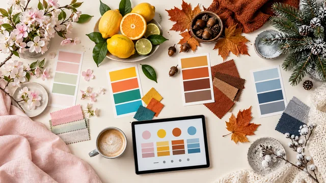
Spring, summer, autumn, winter: each season has a color signature. Here is how to generate palettes that evoke them.
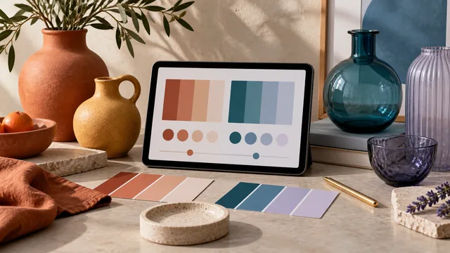
Temperature quietly controls the mood of a palette. Learn to read it, and to balance warm against cool on purpose.
Reviews
Designers, developers and marketers use Palette Generator to build color schemes, convert formats and check contrast. Here is what they say about working with it.
I pull a base palette straight out of a client's product photo, lock the two brand colors and let the generator fill in the rest. It has quietly replaced three bookmarks in my toolbar.
Exporting straight to CSS custom properties is the part I use every day. I paste the block into my tokens file and the theme work is basically finished.
Having the contrast checker in the same place where I build the palette means I stopped shipping text that nobody could comfortably read. That alone earned it a spot in my workflow.
The harmony rules behave exactly the way color theory says they should. Triadic hands me three colors I can actually defend in a client meeting.
A quiet, well-made interface with no sign-up wall. I open it, tap the space bar a few times, and I have a direction to start designing from.
I extract palettes from concept art and the image sampling gets close enough that I usually only nudge a single swatch before it goes into the game.
Seeing HEX, RGB and HSL side by side saved me a lot of guesswork while building a dark theme. The HSL lightness values made the ramp obvious.
We rebuilt our entire slide-deck palette here in about ten minutes. The ready-made shade ramp turned out to be the most useful part for us.
Lock a color, regenerate the rest, repeat. It is the fastest way I know to explore the space around a fixed brand color without losing it.
I lean on the tetradic option for backgrounds. It gives me real variety while still reading as one coherent picture.
Contrast badges sitting right next to the ratio turned accessibility into something I check while designing instead of something I fix afterwards.
Free, fast, and the values are exact. I have sent this link to every junior designer I have worked with this year.
Questions
Everything people ask about generating color palettes, converting formats and shipping accessible color. Tap any question to open its answer.
A palette generator is a free online tool that turns a starting point — a single color, a hex code or an image — into a coordinated set of colors that belong together. It places each color using color-wheel relationships such as complementary, analogous and triadic, then spreads the lightness so you get usable tones for both text and backgrounds. You keep full control: lock what you like and regenerate the rest.
Click Palette from an image in the generator, or drag a photo onto the panel. The tool samples thousands of pixels in your browser, groups similar ones into clusters and reports the center of each cluster as one swatch. Pictures with a clear subject and even lighting give the cleanest result. Nothing is uploaded — the whole extraction runs on your device.
Yes. Type a six-digit hex code into the base color field, or pick a color with the swatch next to it, then choose a harmony rule. The generator builds partner colors around that base using the rule you picked. Lock the base swatch and press Space to keep it fixed while everything else changes.
Harmony rules are the geometric relationships a generator uses to place colors on the color wheel. Monochrome stays calm and safe, analogous feels rich and cohesive, complementary gives you a built-in accent, and triadic or tetradic add bold, balanced variety. For interfaces start with analogous or complementary; for illustration try triadic. Our color harmony guide covers each rule in detail.
Five is the sweet spot for most projects: one primary, one accent, one dark ink and two neutral surfaces. Fewer than four rarely gives you enough range for a real interface, and more than eight becomes hard to apply consistently. The 60-30-10 rule is a good sanity check — one color should dominate, one should support and one should accent.
Hover or focus any swatch in the generator and click the padlock icon. Locked swatches keep their exact value while every other color is rebuilt around them, so you can hold a brand color steady and explore the space around it. Press Space or click Generate to produce the next variation.
HEX and RGB describe the same screen color in different notation — HEX is a compact six-digit form of the red, green and blue channels. HSL restates that color as hue, saturation and lightness, which makes it far easier to build tints and shades by hand. CMYK is a subtractive model for print. The converter shows all of them, plus HSV, for any color you enter.
Every swatch copies its exact hex code with one click. The Export menu copies the whole palette as CSS custom properties, Sass/SCSS variables, a Tailwind color config, a JSON array or a plain hex list — ready to paste straight into your project. Nothing is watermarked and there is no export limit.
Accessibility depends mostly on the contrast between text and its background. Paste any two colors into the contrast checker and confirm the pairing meets WCAG AA. Also separate your colors by lightness, not just hue, so the palette still works for people with color vision deficiency, and never rely on color alone to carry meaning — pair it with icons, labels or shapes.
WCAG 2.1 level AA asks for at least 4.5:1 for normal body text and 3:1 for large text (18pt, or 14pt bold) and meaningful graphics. Level AAA raises body text to 7:1. The contrast checker on this page shows the exact ratio and marks each threshold as pass or fail as you type.
Yes — completely. Every tool on this site, including the palette generator, the color converter and the contrast checker, is free with no sign-up, no account, no watermark and no daily limit. You can use the palettes you create in personal and commercial work without attribution.
No. Color extraction, conversion and contrast math all run locally in your browser using the canvas API. Your images never leave your device, are never sent to a server and are never stored. That is also why results are instant and match exactly what you will ship in code. See our privacy policy for the full detail.
Bookmark Palette Generator as your go-to for building color schemes, converting formats and checking contrast — free, fast and built for designers and developers.