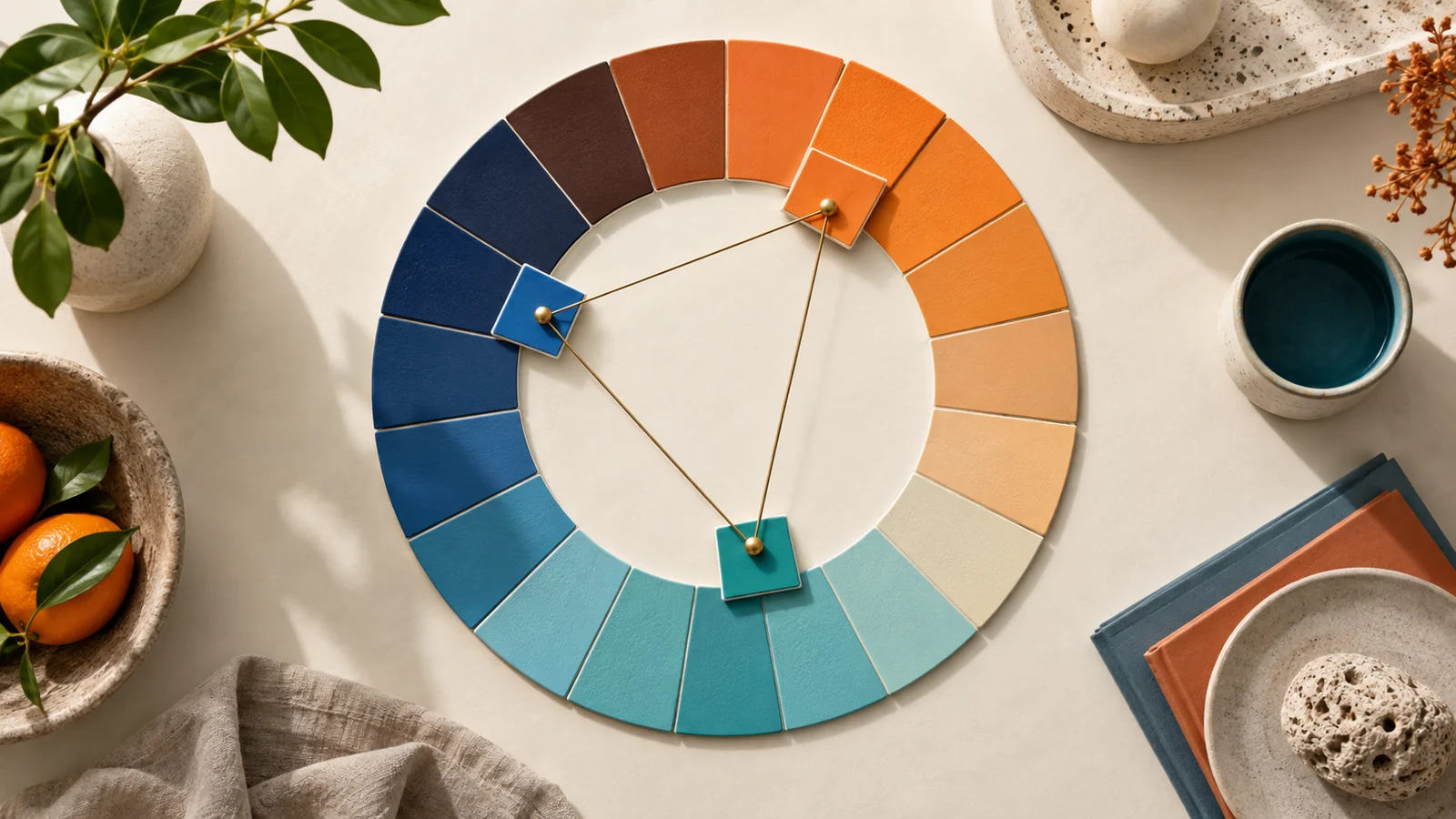
Color harmony is the reason some palettes feel effortless and others feel like an argument. Every palette generator leans on a handful of geometric rules borrowed from the color wheel. Understand the rules and you can predict what the tool will give you — and correct it when the result is technically right but visually wrong.
Key takeaways
- A harmony rule is just a pattern of angles on the color wheel — nothing more mysterious than that.
- Complementary maximises contrast; analogous maximises cohesion. Most interfaces want both.
- Triadic and tetradic sets need one clear leader, or the colors compete with each other.
- Hue is only half the palette: saturation and lightness decide whether the set actually works.
The color wheel in one paragraph
Arrange every hue in a circle: red at the top, flowing through orange, yellow, green, blue and violet, then back to red. Harmony rules are simply patterns for picking positions on that circle. Hue is the angle, and how far apart two hues sit is what makes them feel related, tense, or opposed. Everything else in this article is a variation on that one idea.
Complementary: opposites that pop
Two hues directly across the wheel, 180 degrees apart. The contrast is maximal, which makes complementary pairs ideal when one color must grab attention against another — an accent button on a calm background, for example. The risk is vibration: at full saturation, complementary colors buzz against each other and become tiring to look at. Tame it by letting one dominate the layout and using the other only in small doses.
Analogous: neighbors that blend
Three hues sitting next to each other, usually about 30 degrees apart. Because they share underlying pigment, analogous palettes feel calm and cohesive — think of a sunset moving from red through orange into yellow. The trade-off is low contrast, so vary lightness generously or the elements in your layout will blur into one another.
A useful instinct: analogous for mood, complementary for emphasis. Most real interfaces run an analogous base with a single complementary accent for calls to action.
Triadic: three-way balance
Three hues spaced evenly 120 degrees apart. Triadic palettes are vivid and playful while staying balanced, which is why they appear so often in illustration, education and children's products. The discipline they demand is hierarchy: keep one hue dominant and the other two supporting, or the palette spends the whole layout arguing with itself.
Tetradic: two complementary pairs
Four hues forming two complementary pairs — the most flexible rule and the hardest to balance, because you now have four strong voices in the room. Choose one to lead, mute the rest by lowering their saturation, and treat the fourth color as a detail shade rather than a full member of the palette.
Split-complementary: the safe accent
A useful middle path that generators often offer: take one base hue, then instead of its exact opposite, use the two hues sitting either side of that opposite. You keep the energy of a complementary contrast while losing most of the vibration, which makes split-complementary a dependable choice for interfaces that need a lively accent without visual noise.
Why generators still need your eye
These rules operate on hue alone, but a palette lives or dies on saturation and lightness too. A mathematically perfect triadic set can still look wrong if all three colors share the same punchy saturation, or if none of them is light enough to serve as a background. That is why the reliable workflow is generate, then adjust: let the tool place the hues, and you shape the tone.
Reading a palette backwards
Harmony rules are just as useful in reverse. When you find a palette you admire, drop its colors into a converter and read the hue values: if they sit roughly 30 degrees apart you are looking at an analogous set, 120 degrees apart means triadic, and a pair near 180 degrees is complementary. Doing this a dozen times builds an instinct faster than any amount of theory, because you start recognizing the underlying pattern behind palettes you already like. It also explains near-misses — a set that feels almost right is often one hue out of place, and knowing the intended angle tells you exactly which color to move and how far.
Frequently asked questions
Which harmony rule should a beginner start with?
Analogous with a single complementary accent. It is difficult to get wrong, it produces a clear focal color for buttons, and it covers the majority of web and app work.
Can I mix two harmony rules in one palette?
Yes, and most mature systems do. Generate an analogous base, then add one color from a complementary or triadic relationship as the accent. Harmony rules are starting points, not exclusive categories.
Why does my complementary palette look harsh?
Both colors are probably near full saturation and similar lightness. Drop the saturation of one and widen the lightness gap, and the same pair becomes comfortable.
When you are ready to formalize the result, our harmony rules guide maps each rule to its setting in the generator, and how a palette generator reads color covers the math underneath.