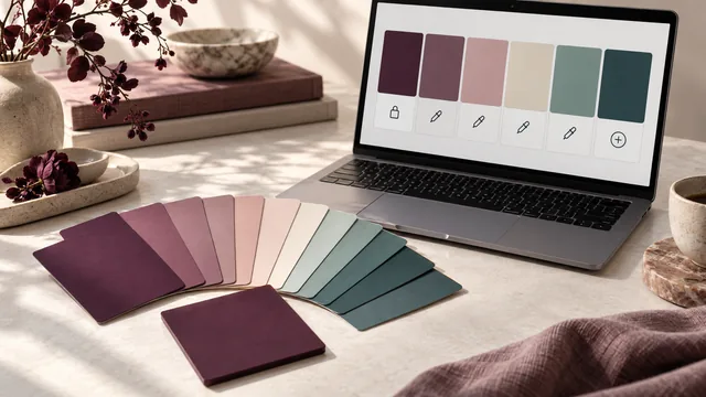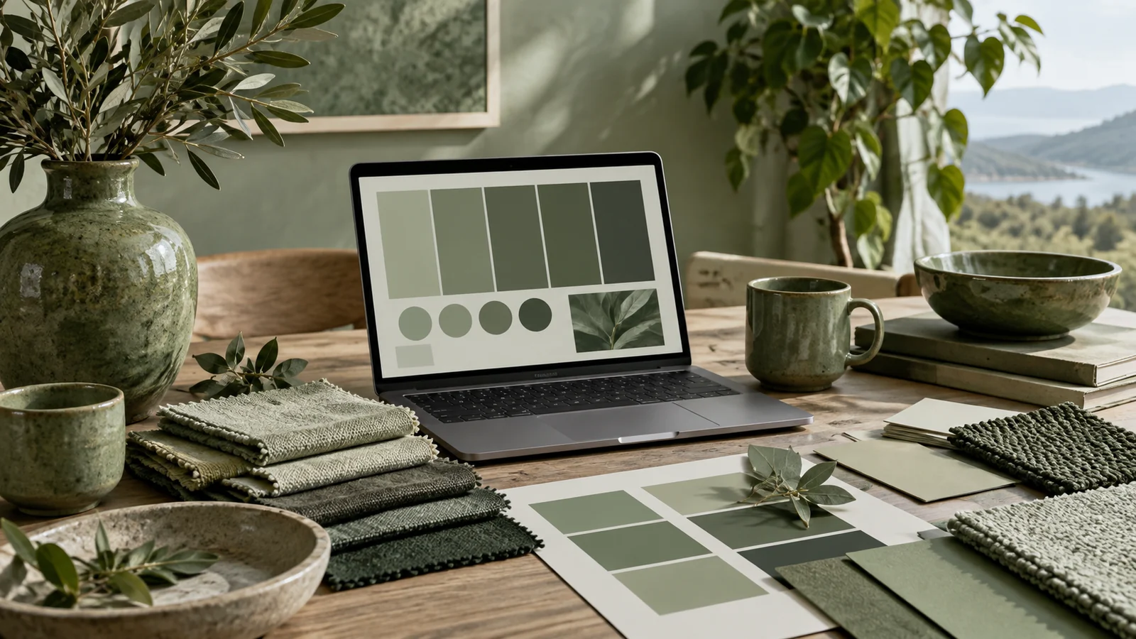
A monochrome palette uses a single hue and varies only its lightness and saturation. It is the safest palette to build — nothing can clash when everything shares one hue — which is exactly why it so often turns out flat and forgettable. The craft is keeping a single-hue palette alive.
Key takeaways
- Uneven, generous lightness steps are what separate a palette from a blur.
- Vary saturation alongside lightness so the ramp behaves like real material in light.
- Add one near-white and one near-black, both tinted with your hue.
- Break the monochrome exactly once, if at all — that single accent carries enormous weight.
Why beginners' monochromes fall flat
The usual mistake is varying lightness in even, small steps, which produces a palette that reads as one slightly blurry color. The steps are too close together and too regular, so the eye merges them. A living monochrome palette needs uneven, generous jumps in lightness, so each shade is unmistakably its own color rather than a neighbor's cousin.
If you cannot name every shade in your monochrome palette as a distinct color, the steps between them are too small.
Vary saturation, not just lightness
The ingredient most people miss: change saturation alongside lightness. Let the lightest tint be gently desaturated and the darkest shade be richer and deeper. This mimics how real materials behave under light — highlights wash out, shadows concentrate pigment — and it stops the palette from looking like a math exercise rendered as rectangles. Our own ramp from ink to blush does exactly this.
Add one true neutral
A pure monochrome palette gives the eye nowhere neutral to rest. Adding a single near-white and a single near-black — each tinted very slightly with your hue — gives you backgrounds and text without breaking the single-hue discipline. This is what keeps a monochrome scheme usable for real interfaces rather than only for decoration, and it is the difference between a palette and a swatch card.
Contrast is easy here — spend it
Monochrome palettes make accessibility straightforward, because a wide lightness range guarantees strong text-and-background pairings. Pair your darkest shade with your lightest tint and you will comfortably clear WCAG AA, often AAA. This is why monochrome is a favorite for content-heavy, highly readable design — and why it is a good first palette for anyone nervous about accessibility.
Use the ramp for hierarchy, not decoration
Once you have five or six steps, assign each a job rather than sprinkling them by eye: the two lightest become surfaces, the middle two become borders, dividers and disabled states, the darkest two carry text and primary actions. A monochrome palette with assigned roles produces layouts with obvious hierarchy, because depth is doing the work that hue does elsewhere. Without roles, the same ramp produces the mush people blame the technique for.
When to reach for it
Monochrome suits premium, minimal and editorial work, where restraint reads as confidence. It also suits any project with a strong photographic component, since a single-hue interface never competes with the images inside it. When you need one deliberate accent, break the monochrome exactly once with a complementary color — that single departure carries enormous weight precisely because everything else agrees.
The one-accent decision
Most monochrome designs eventually need something the hue cannot provide: a color that means "act here" or "something went wrong". Decide early whether your system allows exactly one accent, and if so what it is for. A single complementary accent used only for primary actions keeps the discipline intact and makes those actions unmissable. Adding a second accent almost always begins the slide back into an ordinary multi-color palette, at which point the restraint that made the design distinctive is gone. If you need error, warning and success states, treat those as functional colors documented separately from the brand palette rather than as new palette members.
Frequently asked questions
How many steps should a monochrome ramp have?
Five to seven. Fewer and you run out of roles; more and adjacent steps stop being distinguishable, which returns you to the blur problem.
Is grey a monochrome palette?
Technically yes, but a hue-tinted neutral almost always looks better. Pulling greys a few degrees toward your brand hue makes an interface feel designed rather than default.
Can a monochrome palette work for a brand?
Very well, provided the single hue is distinctive. Monochrome identities are highly recognizable because every surface reinforces the same color memory.
Start from one color, set the generator to monochrome, and widen the steps until each swatch earns its place.