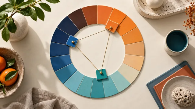
You pick two lovely colors, blend them into a gradient, and the middle turns to mud. This is one of the most common frustrations in color work, and it has a precise cause and three reliable fixes. A palette generator helps by handing you the intermediate colors a straight blend gets wrong.
Key takeaways
- Mud appears because the shortest path between distant hues passes through desaturated grey.
- The wider the hue gap, the deeper the muddy dip — complementary pairs are the worst offenders.
- Adding one saturated mid-stop removes the problem in a single line of CSS.
- Gradients that move mostly in lightness cannot go muddy at all.
Why the middle goes grey
A gradient interpolates between two colors. When those colors sit far apart on the wheel, the shortest path between them cuts across the middle of the color space rather than around its edge — and the middle of the color space is grey. So a red-to-teal gradient does not travel through vivid intermediate colors; it dips through a dull brown-grey on the way, which is exactly the sludge you are seeing.
The wider the hue gap between your two endpoints, the deeper the muddy dip in the middle. Complementary gradients are the worst offenders.
Fix one: add a bright mid-stop
The simplest cure is to stop letting the software choose the middle. Generate a palette between your two endpoints, pick an intermediate color with healthy saturation, and set it as an explicit middle stop. Now the blend travels through a color you chose rather than through the color space's center.
Fix two: keep the endpoints close
Analogous gradients — endpoints within about 60 degrees of each other — never go muddy, because the path between them stays in saturated territory the whole way. If mud keeps reappearing no matter what you try, the endpoints are simply too far apart for a two-stop blend. Generate an analogous pair and blend those instead; you will lose some drama and gain a gradient that works everywhere.
Fix three: vary lightness, not just hue
A gradient that moves mostly in lightness — a dark plum into a light blush of the same hue — is impossible to muddy, because it never crosses the desaturated center. Monochrome gradients are the safest of all, and they read as premium and controlled rather than loud, which is why so much luxury and editorial design uses them behind text.
When exporting to CSS, remember that adding a middle color stop is a one-line change. You do not have to accept the browser's default two-stop interpolation.
Angle and area matter too
A gradient that looks clean as a small button fill can turn murky stretched across a hero section, because the muddy band gets more room to be noticed. Test a gradient at the size it will ship, not in a swatch. Steeper angles compress the transition and hide a weak middle; shallow, wide gradients expose it. If a gradient only works small, it is a button gradient, not a background one.
Match the gradient to its job
Bold multi-hue gradients suit hero sections and marketing moments where the gradient is the subject. Quiet monochrome gradients suit backgrounds that sit behind text, where anything more competes with the words. Choosing the right type for the job prevents both mud and distraction. Store the final stops as CSS custom properties so the same gradient stays identical everywhere it appears.
Banding, and how to avoid it
Mud is one failure; banding is the other. A large, subtle gradient rendered in eight bits per channel can show visible steps, particularly across dark tones where the eye is most sensitive to small differences. Three habits prevent it: keep very low-contrast gradients small, add a barely perceptible noise or grain overlay to break the steps, and avoid stretching a two-stop dark gradient across a full-width hero. If you can see rings in a background, the fix is almost never more color stops — it is either more contrast between the endpoints or a texture that disguises the transition. Both take a minute and both survive compression better than a perfectly smooth gradient does.
Frequently asked questions
How many stops should a gradient have?
Two for a monochrome blend, three when the endpoints are more than about 90 degrees apart. Beyond four the gradient usually reads as banded rather than smooth.
Do newer CSS color spaces fix muddiness?
They help. Interpolating in a perceptual space produces a more even path than the classic sRGB blend, but a deliberately chosen mid-stop still gives you more control than any automatic method.
Can I put text on a gradient?
Only if every point along the gradient passes contrast against the text color. Check both endpoints and the middle in the contrast checker, since the middle is often the weakest.
A gradient is a palette with infinite members, so the usual palette discipline applies: control the extremes, choose the middle deliberately, and check it where text lands.