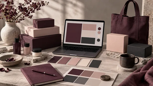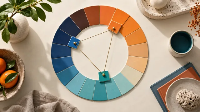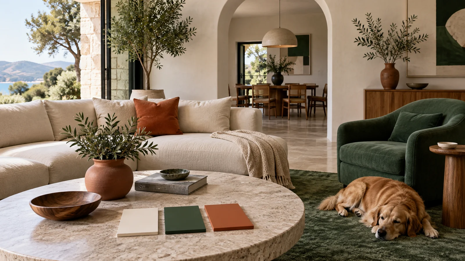
Two designers can start from an identical palette and produce work that feels completely different. The colors are the same; the proportions are not. The 60-30-10 rule is the oldest and simplest guide to getting those proportions right, and it is what turns a flat row of swatches into a composition with a clear hierarchy.
Key takeaways
- Split a design's color into three unequal shares: 60% dominant, 30% secondary, 10% accent.
- The accent works because it is scarce — spend it everywhere and it stops signalling anything.
- A five-color generated palette maps onto the ratio with two colors left over for detail work.
- Treat 60-30-10 as a starting default, then depart from it deliberately rather than by drift.
What the three shares actually mean
The rule divides the visible color in a layout into three unequal portions:
- 60% dominant — page backgrounds and the largest surfaces. Usually a neutral or a very light tint. This is the color the eye rests on, and it should be quiet enough to look at for minutes at a time.
- 30% secondary — sections, cards, navigation bars and containers. It gives the layout structure and separates one region from the next without shouting.
- 10% accent — buttons, links, badges, focus rings, chart highlights. The color that tells the eye where to act.
The percentages are proportions of visual area, not a rule about how many colors you may own. A design system can hold twenty tokens and still resolve to three shares on screen.
The accent is powerful precisely because it is rare. Spend it on everything and it stops meaning anything.
Mapping a generated palette to the ratio
A five-color palette from a palette generator maps onto 60-30-10 with room to spare. Take your lightest color as the 60 percent dominant, a mid-tone as the 30 percent secondary, and your most saturated color as the 10 percent accent. The two colors left over become detail shades — borders, dividers, hover fills, muted text — that live inside the three main shares rather than competing with them.
Why the ratio reads as balanced
The rule mirrors how color arrives in balanced natural scenes: a large calm field, a medium supporting mass, and one small point of interest. The eye parses that hierarchy instantly, before it reads a single word. Give three colors equal area instead and you remove the hierarchy — there is nowhere to rest, no obvious focal point, and every element competes for the same attention.
Applying it to a real screen
Translating the ratio into an interface is mostly a question of where large areas live:
- Paint the page background and the majority of surfaces in the dominant color.
- Use the secondary for headers, sidebars, footers and card fills — the furniture of the layout.
- Reserve the accent for the primary call to action on each view, plus links and state indicators.
- Step back and squint. If the accent forms more than a small cluster of marks, you are over budget.
The squint test is the fastest audit there is, and it catches accent creep long before a design review does.
Bending the rule on purpose
Like every design rule, 60-30-10 is a default worth leaving knowingly. A bold brand moment might push the accent to twenty percent for deliberate impact. A dense data dashboard often works better at 70-20-10, because the extra neutral keeps a busy screen calm. Editorial layouts sometimes invert the shares entirely for a single hero section. Start from 60-30-10, then adjust with intent — the failure mode is never a considered exception, it is proportions that drifted while nobody was watching.
A five-minute proportion audit
Run this check on any screen before it ships. Take a screenshot, blur it heavily, and look at what remains. You should see one large calm field, a clearly secondary mass, and a scattering of accent marks — in that order of prominence. If the accent forms a band rather than a scatter, it is over budget. If the secondary and dominant are hard to tell apart, they are too close in lightness to be doing two different jobs, and the layout will feel structureless no matter how good the colors are. The blur test works because it removes everything except proportion, which is precisely the property the rule governs and the one that is hardest to judge with type and imagery in the way.
Frequently asked questions
Does the 60-30-10 rule work with more than three colors?
Yes. Extra colors do not get their own share; they sit inside one of the three. Two supporting neutrals both belong to the 60 percent dominant band, and a second highlight belongs to the 10 percent accent band.
Which color from my palette should be the accent?
Usually the most saturated one, provided it passes contrast where it carries text. Check the pairing in the contrast checker before committing, because an accent that fails on your dominant surface cannot be used for buttons or links.
Is 60-30-10 only for interiors and web design?
No. The ratio applies anywhere color occupies area — slide decks, packaging, illustrations, even game and Minecraft builds. Only the surfaces change; the hierarchy the eye expects does not.
Once your proportions are settled, document them alongside the hex values so the ratio survives handoff, as covered in turning a palette into a brand system.