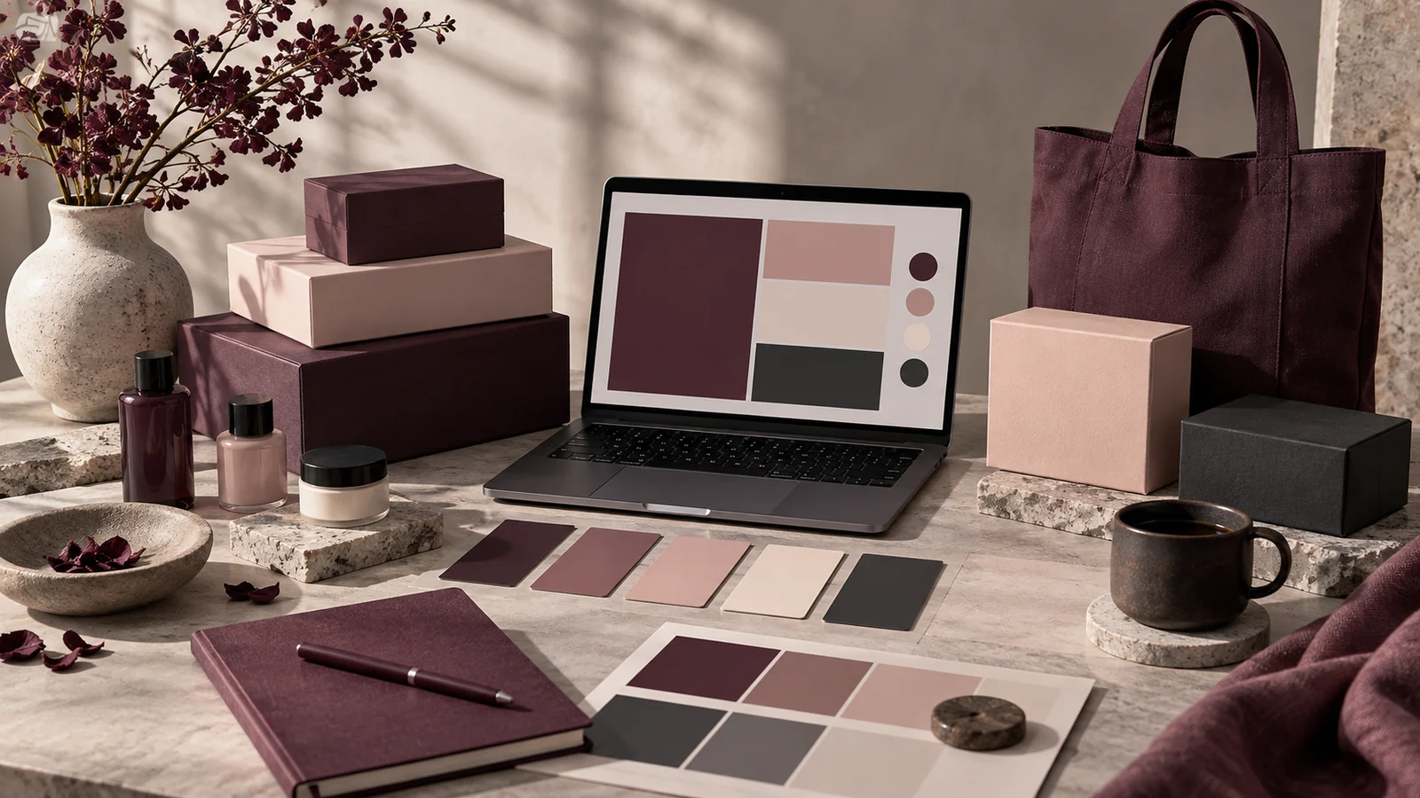
A generated palette is raw material. A brand system is that material organized so that anyone on a team can make consistent decisions without asking you first. The gap between the two is not more colors; it is structure — roles, neutrals, ratios and written rules.
Key takeaways
- Name colors by job — primary, secondary, accent, neutral — not by appearance.
- Add the near-white, near-black and greys the generator skipped, derived from your brand hue.
- Document proportion as well as membership, or the accent will slowly take over.
- Record every value in hex, RGB and CMYK so nobody has to guess.
Assign a role to every color
The first move is to stop thinking of your colors as "the pink one" and "the dark one" and start naming them by job:
- Primary — the color most associated with the brand, used for key actions and brand moments.
- Secondary — a supporting color that adds variety without competing with the primary.
- Accent — a small-dose color reserved for highlights and calls to action.
- Neutrals — the workhorses that carry backgrounds, body text and borders.
A five-color generated palette rarely includes enough neutrals, which leads directly to the next step.
Add the neutrals the generator skipped
Most palettes are all personality and no plumbing. You need a near-white surface, a near-black ink, and one or two greys in between. Derive them from your brand hue rather than reaching for pure grey: a neutral with a whisper of the brand color in it — like our ink #28151F, black pulled toward plum — makes the whole system feel intentional rather than assembled from two unrelated sources.
A quick test of a mature palette: can you build an entire interface — background, text, borders, one button — using only the colors in your system? If you keep reaching for colors that are not in it, the palette is incomplete.
Define the ratio, not just the members
Document not only which colors exist but how much of each to use. The 60-30-10 rule gives a starting ratio: a dominant neutral, a secondary brand color, and a small accent. Writing this down is what prevents the slow drift toward everything being brand-colored — the failure mode of every young brand that loves its primary a little too much.
Build a scale for each brand color
One value per role is never enough in practice. Hover states, disabled controls, tinted backgrounds and borders all need related shades. Generate a five- or nine-step ramp for each brand color and name the steps numerically, so a developer can ask for "primary 200" instead of inventing a lighter pink on the spot. A ramp is what turns a palette into something a team can build interfaces with.
Record the exact values, in every format
A brand color that lives only in a designer's head is a color that will be reproduced wrong. Document each one as hex for web, RGB for screen tools, and CMYK for print. The converter produces all three from a single hex, so the whole exercise takes minutes and saves a print run.
Write usage rules, not just swatches
The most valuable page in any brand guide is the do-and-don't for color: primary is never used for body text, accent never fills more than a tenth of a screen, neutrals carry the layout. These rules are what let a team stay consistent when you are not in the room, and they are far more useful than another page of swatches.
Ship it as a file people can use
A brand system that exists only as a PDF gets ignored by the people who most need it. Deliver the palette in the formats each audience actually works in: a design tool library for designers, a token file or CSS block for developers, a plain hex list for anyone in a document tool, and a one-page summary of roles and ratios for everyone else. The PDF is a reference, not a delivery mechanism. Systems succeed when the correct color is the easiest color to reach, and that is a distribution problem far more often than it is a design one.
Frequently asked questions
How many colors should a brand system have?
Two or three brand colors plus a full neutral ramp covers most brands. Additional colors usually belong to sub-brands or to data visualization, and should be documented separately.
Should the logo color always be the primary?
Not necessarily. The logo color is the identity; the primary is the interface color. When the logo color fails contrast for buttons, derive a usable variant and say so explicitly in the guide.
How often should a palette be revisited?
When the brand changes, or when designers keep reaching outside the system. Frequent exceptions are evidence of a gap, not of undisciplined designers.
Our branding guide expands each of these steps into a working checklist.