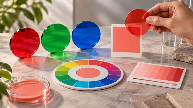
Every palette a generator produces comes from a harmony rule — a pattern for choosing positions on the color wheel. Knowing the rules lets you predict what the tool will hand you and correct it when the result is technically right and visually wrong. This guide maps each rule to what it does and when to reach for it.
Key takeaways
- Harmony rules are recipes for picking angles; the generator does the arithmetic in HSL.
- Monochrome and analogous favor cohesion; complementary and triadic favor contrast.
- The more hues a rule introduces, the more strictly you need one to lead.
- Hue alone never decides whether a palette works — saturation and lightness finish the job.
The color wheel, quickly
Arrange every hue in a circle and measure position as an angle from 0 to 360 degrees. Harmony rules are simply recipes for picking angles. The generator does the arithmetic in HSL, where hue is that angle, then converts each result back into the hex codes you copy.

Monochrome
One hue, varied in lightness and saturation. The safest palette — nothing can clash — and the easiest to make accessible, because a wide lightness range guarantees strong contrast pairings. The risk is flatness, so vary the steps generously and change saturation as well as lightness. See monochrome palettes that work for the technique in full.
Analogous
Neighboring hues, usually about 30 degrees apart. Cohesive and calm, because the colors share underlying pigment. Low contrast is the trade-off, so lean on lightness variation to keep elements distinct from one another. Ideal when the brief asks for a consistent mood rather than a focal point.
Complementary
Two hues directly opposite, 180 degrees apart. Maximum contrast and a built-in accent, which is exactly what a call-to-action needs. Let one color dominate and use the other sparingly, or the pair vibrates when both sit at full saturation.
Split-complementary
A base hue plus the two hues either side of its opposite. You keep most of the energy of a complementary contrast and lose most of the vibration, which makes this the safest way to give an interface a lively accent without visual noise.
Triadic
Three hues evenly spaced 120 degrees apart. Vivid and balanced, common in illustration and playful brands. Keep one hue dominant and the other two supporting, or the palette spends the entire layout competing with itself.
Tetradic
Four hues forming two complementary pairs. The most flexible rule and the hardest to balance — four strong voices need one clear leader and three quieter members, usually achieved by dropping the saturation of everything except the lead.
A dependable default: analogous for the base mood, plus a single complementary color for the accent. It is hard to get wrong and covers most real interfaces.
Choosing a rule for the job
Match the rule to the amount of contrast the work needs. Content-heavy reading interfaces do best on monochrome or analogous bases, where color never competes with text. Marketing pages, dashboards and anything with a single dominant action benefit from a complementary or split-complementary accent. Triadic and tetradic sets suit illustration, education and brands whose personality is the point.
Why hue is only half the job
These rules operate on hue alone, but saturation and lightness decide whether a mathematically correct palette actually looks good. A perfect triadic set still fails if all three colors share the same punchy saturation, or if none is light enough to use as a background. Generate to place the hues, then adjust tone by hand — the workflow explained in how a palette generator reads color.
Applying a rule you did not choose
Often the palette arrives before you do — a brand guide hands you five colors and asks for a sixth, or a client wants an existing set extended to a new product line. Read the existing hues first and identify which rule they already follow, then extend along the same logic rather than inventing a relationship. If the set is analogous, the new color belongs at the edge of the same run; if it is complementary, the addition usually belongs as a tint or shade of an existing member rather than as a new hue. Palettes look incoherent far more often because a color was added outside the pattern than because the original pattern was wrong.
Frequently asked questions
Which harmony rule is best for websites?
Analogous with one complementary accent, in the large majority of cases. It keeps interface color quiet and gives buttons and links a color the eye finds immediately.
Can a palette break its own harmony rule?
Yes, and good ones often do. The rule places the colors; a single deliberate exception is what gives a palette character.
Do harmony rules apply to neutrals?
Neutrals sit outside the rule, but tint them toward your base hue so they belong to the same family rather than looking imported.
For a plain-language walkthrough of the same rules, read color harmony explained simply.