Most palettes start from a single fixed point: a logo color, a product color, a color a client already loves. The task is not to invent a palette from nothing but to grow one outward from that anchor. A palette generator from one color is built for exactly this, and the workflow below takes about five minutes.
Key takeaways
- Enter the anchor as an exact hex code — every color that follows is math performed on that value.
- The harmony rule you choose decides where the partner colors come from on the wheel.
- Lock the anchor before regenerating, so each pass proposes new partners instead of a new palette.
- Judge the result on lightness spread, not on hue: a palette with no dark and no light has nowhere to put text.
Start with the exact hex code
Type your known color as a six-digit hex value rather than eyeballing it from a screenshot. Everything the generator does next is arithmetic performed on that number, so a value that is one shade off quietly pushes the whole palette off with it. If you only have an RGB, HSL or CMYK value to hand, convert it first in the color converter and paste the result.
Choose how the other colors should relate
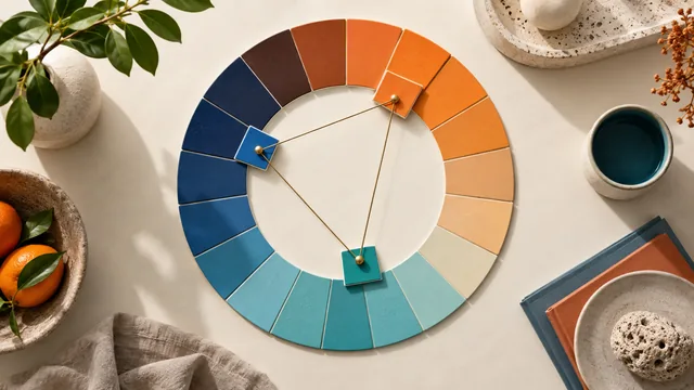
The single most important choice is the harmony rule, because it decides where on the color wheel the partners are taken from:
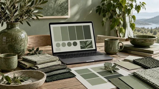
- Monochrome keeps the same hue and varies only lightness and saturation. Safe, calm, and the easiest to make readable.
- Analogous pulls neighbors roughly 30 degrees to each side. Rich and cohesive, but low in contrast.
- Complementary adds the opposite hue, which hands you a built-in accent for buttons and links.
- Triadic spaces three hues evenly for a bold, balanced set that suits playful brands.
If you are unsure, start monochrome and add one complementary accent by hand. That combination is difficult to get wrong and covers most real interfaces.
The base color rarely belongs in the final design at full strength across every surface. Treat it as the seed the others grow from, not a color you are obliged to use everywhere.
Lock the anchor, then regenerate freely
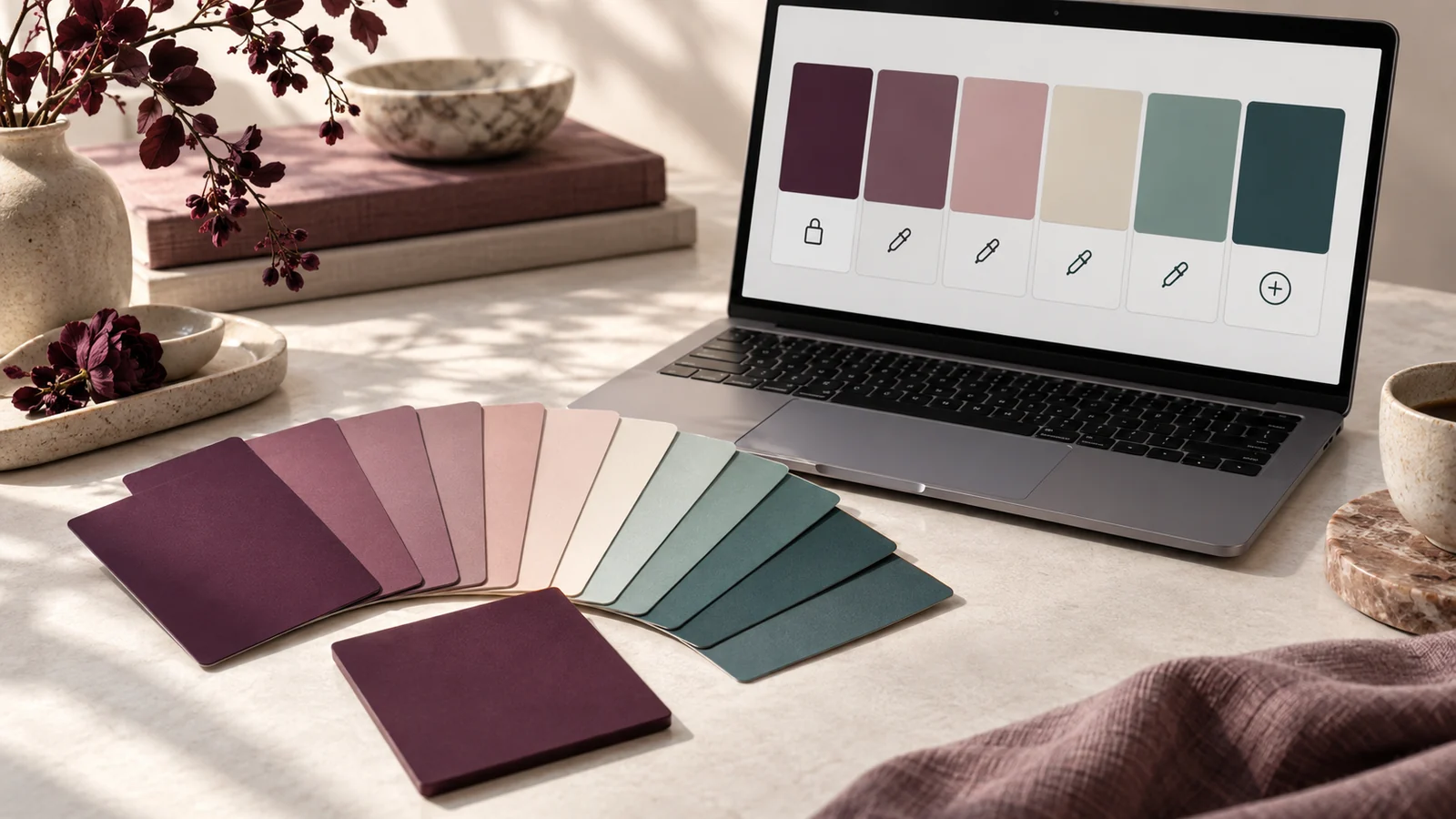
Lock your base color so the generator never overwrites it, then regenerate as often as you like. Each pass keeps the anchor and proposes new partners around it, which turns generation from a lottery into a search. Stop when a set holds together across both light and dark surfaces, not when a single swatch catches your eye.
Check the spread before you commit
A palette built from one color can quietly collapse into shades too similar to tell apart. Two fast tests catch it:
- Squint at the swatches. If two blur into one, widen the lightness gap between them.
- Preview the darkest color as text on the lightest as background. If that pairing fails, the palette has no safe text combination yet.
Run the winning pair through the contrast checker before you build anything on top of it. Fixing a failing pairing at this stage costs one slider adjustment; fixing it after a layout exists costs a rebuild.
Add the neutrals the generator skipped
A five-color result is usually all personality and no plumbing. Before the palette meets a real design, add a near-white surface and a near-black ink, both tinted very slightly with your anchor hue. Neutrals derived from the base rather than pulled from pure grey are what make a single-color palette feel deliberate instead of assembled.
Common failure modes and their fixes
Three problems account for most disappointing single-color palettes. The first is hue monotony: every partner sits within a few degrees of the anchor, so the palette reads as one color slightly out of focus — widen the harmony rule or the lightness steps. The second is saturation uniformity, where every swatch is equally vivid and nothing recedes; drop the saturation of the supporting colors and the anchor immediately gains authority. The third is the missing extreme: no color is light enough for a background or dark enough for text, which makes the palette unusable regardless of how attractive it looks in a row of chips. Each has a one-slider fix, and catching them early costs seconds rather than a redesign.
Frequently asked questions
How many colors should I generate from one base?
Five is the practical sweet spot: one dominant, two supporting, one accent and one detail shade. Beyond that, extra swatches tend to duplicate roles you already filled.
What if the client's brand color fails contrast everywhere?
Keep it as the brand identity color and derive a darker variant of the same hue for text and links. The identity survives, and the interface becomes readable — a standard move in mature design systems.
Can I start from a color that is nearly white or nearly black?
Yes, but generate in monochrome. Near-neutral anchors carry very little hue information, so harmony rules that rotate hue produce results that barely differ from one another.
For the theory behind why these rules produce colors that feel related, read the guide to the harmony rules a palette generator uses.