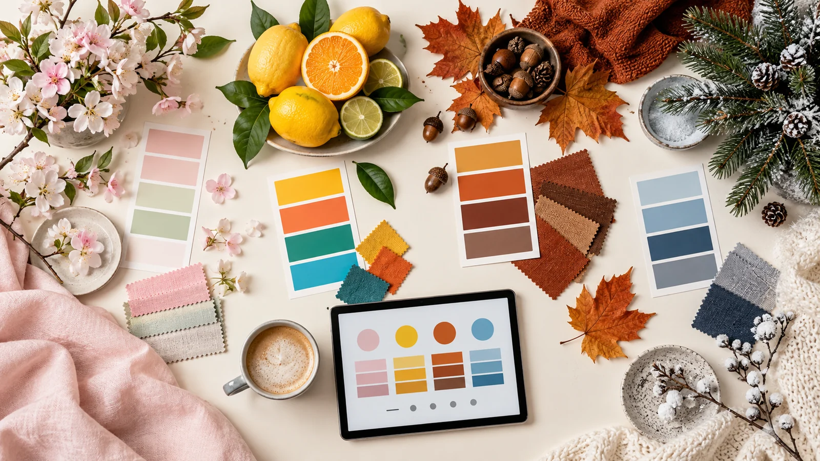
Seasonal palettes feel intuitive but they are surprisingly precise. Each season has a signature not just of hue but of saturation and lightness, and matching all three is what makes a palette read unmistakably as autumn or spring rather than as "some warm colors" or "a few cool ones".
Key takeaways
- Set the hue region for the season, then dial saturation and lightness to its signature.
- Spring is light and clear; summer is bright and warm; autumn is deep and muted; winter is cool and high-contrast.
- Lowering lightness and pulling hues toward red-orange ages a summer palette into autumn.
- Save each seasonal set as a reference list so campaigns stay consistent year to year.
Spring: light, fresh, rising in saturation
Spring colors are clear and lightly saturated with high lightness — new leaves, blossom, early sky. Generate with a base in the yellow-green to soft-pink range, keep saturation moderate, and push lightness high. Avoid anything muddy: spring's defining quality is clarity, and a single desaturated swatch will drag the whole palette toward a different season.
Summer: bright, warm, confident
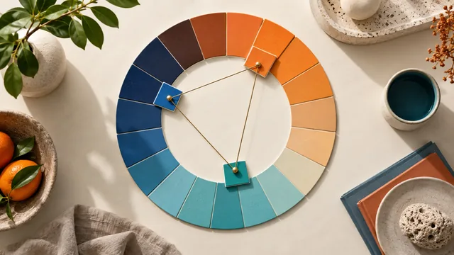
Summer turns up both saturation and warmth. Corals, sky blues and vivid greens at close to full strength. This is the one season where high saturation across an entire palette feels correct rather than loud, so it is also the season most forgiving of a bold complementary pair — warm coral against cool aqua captures summer's energy in two colors.
The fastest way to age a summer palette into autumn is to lower the lightness and pull the hues toward the red-orange side. Same colors, one season later.
Autumn: deep, warm, muted
Autumn is the most beloved seasonal palette for a reason: rich, earthy and effortlessly cohesive. Base it on ochre, rust and deep gold. The key move is lowering saturation from summer's peak and dropping lightness into the mid range. Autumn colors are warm but never bright — they are warmth that has settled, which is why an analogous relationship suits the season better than a complementary one.
Winter: cool, high-contrast, stark
Winter swings cool and dramatic. Icy blues, deep evergreens and crisp near-whites, usually with the highest contrast of any season. Where autumn blends its colors into one another, winter separates them: a near-black paired with a bright cool accent and a great deal of clean space. That contrast is also what makes winter palettes the easiest of the four to make accessible.
Seasonal without being literal
Retail and campaign work often needs a seasonal feeling without the obvious cliché — pumpkin orange in October, red and green in December. The way out is to keep the season's saturation and lightness signature while shifting the hue away from the expected one. A muted, mid-dark palette of plum, moss and clay reads as autumn without a single pumpkin in sight, because the mood is carried by the tone rather than the hue.
Building any season in the generator
The method never changes: set the hue region for the season, then dial saturation and lightness to its signature before generating. Because temperature and mood come mostly from those two properties, they do most of the seasonal work while the harmony rule handles the spread. Save each finished set as a reference list so next year's campaign starts where this one ended.
Plan the year as one system
Treat the four seasonal palettes as variations of a single system rather than four unrelated sets. Fix the brand's core hues, then define each season as a documented shift in saturation and lightness away from that core, with one seasonal accent allowed per campaign. Everything stays recognizably the same brand across the year, transitions between campaigns feel intentional, and next spring's designer does not start from scratch. Store all four sets in one file with their hex values and their intended proportions, and the annual color conversation shrinks from a project to a review.
Frequently asked questions
Do seasonal palettes work in the southern hemisphere?
The associations follow the actual season, not the calendar month, so shift the timing by six months and the color logic holds unchanged.
How many colors does a seasonal palette need?
Four is usually enough: a dominant, two supporting tones and one accent. Seasonal palettes rely on tight tonal agreement, and extra colors dilute it.
Can I reuse one brand palette across all four seasons?
Yes — keep the brand hues fixed and shift only saturation and lightness. The identity stays recognizable while the campaign feels seasonal.
To start from a feeling rather than a season, see building a palette from a word or mood.