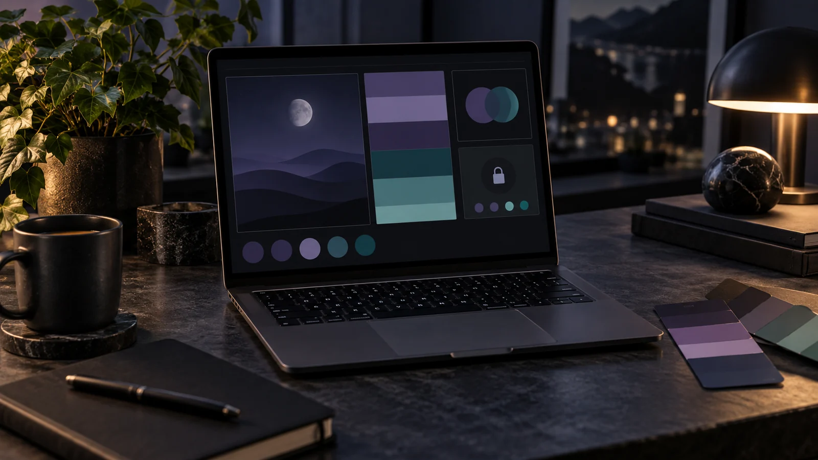
Dark mode is not a switch you flip by inverting every color. Invert a well-tuned light palette and you get harsh black backgrounds, glaring text, and accent colors that suddenly vibrate. A good dark palette is derived deliberately, and a palette generator gives you the raw material to derive it well.
Key takeaways
- Never use pure black — use a near-black tinted with your brand hue.
- Dark themes need a ladder of surfaces, because elevation is shown by getting lighter.
- Accents usually need less saturation and more lightness than their light-mode versions.
- Contrast rules do not relax: light text on dark still needs 4.5:1 for body copy.
Never use pure black
Pure black (#000000) against bright text creates uncomfortable contrast, makes shadows impossible to see, and reads as an absence of design rather than a decision. Real dark themes use a very dark, slightly tinted neutral — a near-black with a hint of the brand hue in it. Our ink #28151F is exactly this: black pulled toward the brand's plum, which quietly ties the dark surface back to the identity.
Build a ladder of surfaces
Light themes get away with a single background because shadow does the work of separating layers. Dark themes cannot: on a dark surface a shadow is invisible, so elevation is expressed by getting lighter. Generate a short monochrome ramp from your dark base and assign each step a job:
Base is the page, +1 is a card, +2 a menu or popover, +3 a dialog. Four steps cover almost every interface; adding more usually means two of them are doing the same job.
Desaturate, then lift your accents
Accent colors that sing on white often scream on a dark surface, because the eye's sensitivity to saturated color rises as the surrounding field darkens. Two adjustments tame them: lower the saturation slightly, then raise the lightness so the color reads as a soft glow rather than a laser. A blush accent that was punchy on cream becomes a gentle highlight on ink with a change of ten or fifteen percent in each direction.
Test accent colors as small elements — a link, a badge, a focus ring — not as large fills. A dark theme rarely uses accents at scale, so judge them at the size they will actually appear.
Recheck every contrast pairing
Contrast requirements do not relax in dark mode. Light text on a dark surface must still hit 4.5:1 for body copy. The good news is that dark surfaces give you room to work: a near-white text color on a near-black surface clears AAA comfortably. Verify each pairing in the contrast checker, then pull the text back from pure white to a soft off-white — it cuts glare during long reading sessions while staying well inside compliance.
Watch the borders and dividers
The detail most dark themes get wrong is the hairline. A border that reads as a subtle grey in light mode often disappears entirely on a dark surface, taking the layout's structure with it. Define border colors as their own tokens with their own dark values — usually a low-opacity white rather than a fixed grey, so they stay visible across every step of the surface ladder.
Ship both themes from one source
Define light and dark as two sets of the same named roles — surface, on-surface, primary, border — driven by the same underlying palette. When you store them as CSS custom properties, switching themes becomes a single attribute change and neither theme can drift away from the other.
Test in the room, not the studio
Dark themes are judged in conditions studios rarely reproduce: a dim bedroom, a bright train, a phone at half brightness. A palette tuned on a calibrated monitor at full brightness will often prove too low in contrast on a phone outdoors and too glaring in a dark room. Check three scenarios before shipping — full brightness in daylight, low brightness at night, and an OLED screen where true blacks make surface steps harder to distinguish. Adjust the surface ladder rather than the text if the layers stop separating, since text contrast is the part you cannot afford to lose. Ten minutes of real-world checking catches problems no ratio calculation reports.
Frequently asked questions
Can I generate a dark palette automatically from my light one?
You can generate the raw material — a monochrome ramp from your brand color — but the role assignments and accent adjustments need a human. Automatic inversion is what produces the harsh results dark mode is criticised for.
Should dark mode use the same brand color?
The same hue, usually a different tone. Keep the hue for recognition, and lift the lightness so the color still separates itself from a dark background.
Is dark mode better for eye strain?
It depends on ambient light. Dark themes help in dim rooms and can hurt legibility in bright ones, which is why offering both — and respecting the system preference — beats picking a side.
Once both themes exist, run a final pass over states — hover, focus, disabled — since those are the pairings that most often ship untested.